LinkedIn Banner Size in 2026 (Exact Dimensions + Safe Zones)
Keep key content in the upper-center, away from mobile crops and profile-photo overlap.

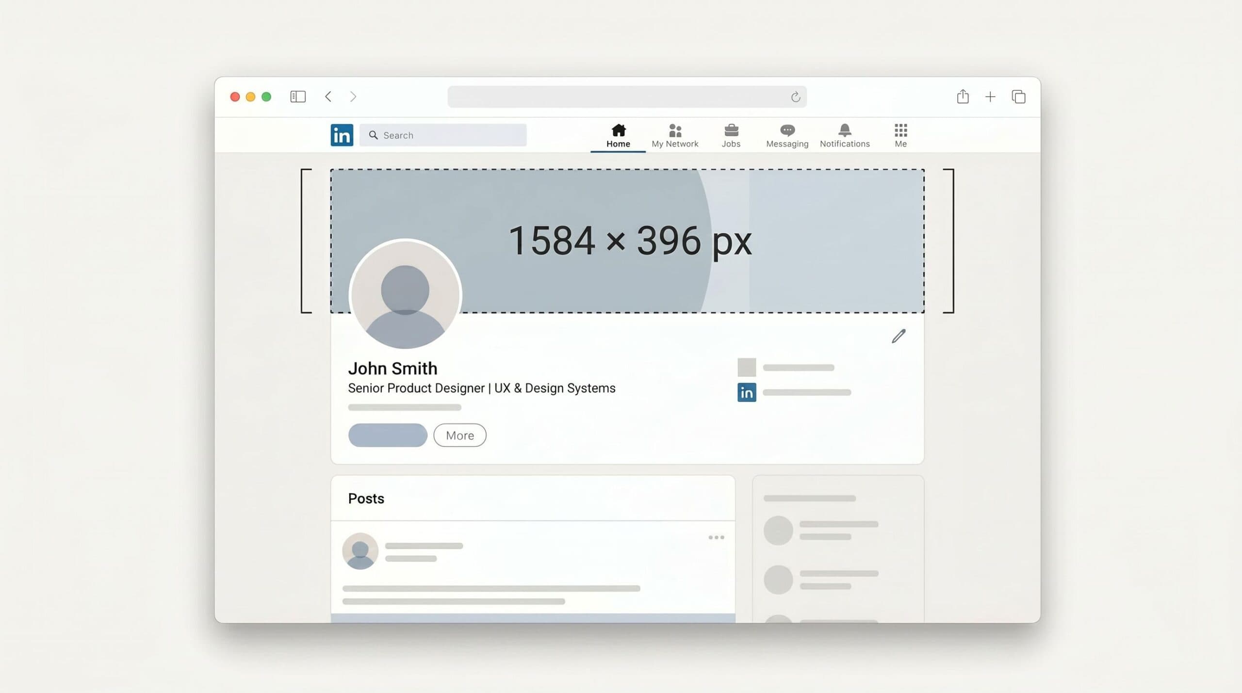
Your LinkedIn banner is the biggest piece of personal real estate you have on the platform. It’s also the easiest thing to get slightly wrong: scroll your feed for two minutes and you’ll see banners with text clipped by a profile photo, logos cut off on mobile, or upscaled stock images going soft.
This is the short, current version: exact dimensions, safe zones, mobile crop math, and the design rules that keep your banner from getting half-eaten on a phone.
LinkedIn banner size at a glance (2026)
| Banner type | Upload size | Aspect ratio | Max file size | Formats |
|---|---|---|---|---|
| Personal profile | 1584 × 396 px | 4 : 1 | 8 MB | PNG, JPG |
| Company page (cover) | 1512 × 256 px | ~5.9 : 1 | 3 MB | PNG, JPG |
| Company “Life” tab cover | 1128 × 376 px | ~3 : 1 | 3 MB | PNG, JPG |
| Showcase page (cover) | 1512 × 256 px | ~5.9 : 1 | 3 MB | PNG, JPG |
Most people only need the first row. If you’re posting from your personal profile, design at 1584 × 396 pixels and stop reading. The rest of this post explains why that exact size, and what to do inside the frame so nothing important gets cut.
Personal profile banner: 1584 × 396 px
This is the banner that sits behind your profile photo on your personal page. The supported size is 1584 × 396 pixels, a 4:1 aspect ratio, max 8 MB as PNG or JPG.
Design at the target dimensions. Anything narrower than 1584 px gets upscaled and goes blurry on retina displays. Anything larger gets downscaled, which mostly wastes file size and softens text.
For format, PNG keeps text sharper and JPG keeps photographic backgrounds smaller. Skip GIF and WebP. The 8 MB ceiling is generous: photographic backgrounds at JPG quality 80 to 85 usually land under 500 KB, and flat-color designs as PNG often land under 100 KB. Maxing out the file size is overkill.
The safe zone (the part of your banner nobody can see)
This is the rule everyone misses. Your profile photo sits over the bottom-left of your banner on desktop, and slightly more centered on mobile. The horizontal edges also get cropped on phones. So three areas of your banner are unreliable, and you have to design around them.
The three unreliable zones on a personal profile banner:
- The profile photo covers a circular area in the bottom-left of your banner on desktop. On mobile, it shifts toward the center and sits lower. Keep critical text and faces out of this zone.
- Phones display a narrower horizontal slice than desktop, so content near the left and right edges gets clipped. Most LinkedIn traffic is mobile, so design for that crop first.
- A thin strip along the top edge can be hidden by LinkedIn’s UI on certain layouts (mostly when viewing other people’s profiles). Don’t anchor anything tight against the top.
The reliable zone is the upper-center of your banner. Put your headline, logo, or call to action there. A simple working rule: imagine a centered rectangle covering roughly the middle two-thirds of the banner width and the upper two-thirds of the height. Anything important goes inside that rectangle.
The cleanest way to handle this in a design tool: place a 1584 × 396 frame, drop a circle representing your profile photo in the bottom-left as a guide, and never let any text overlap that circle or sit within ~10% of any edge. If you preview at 50% width to simulate the mobile crop, anything that disappears in preview is cropped on a phone.
Company page banner: 1512 × 256 px
Company pages use a wider banner than personal profiles. LinkedIn’s official Page cover spec is 1512 × 256 pixels (minimum and recommended), about 5.9:1, max 3 MB as PNG or JPEG. Keep type off the edges, especially the lower-right. See LinkedIn’s Page image specifications.
Things to plan around:
- Your company logo sits in the bottom-left of the banner, so keep that area visually quiet.
- Company banners crop less aggressively than personal banners on mobile, but the outer edges still get clipped. Keep taglines and contact info out of the corners.
- The safe target is the upper-center horizontal third of the frame. Put product visuals, headlines, or launches there.
If you also use the LinkedIn “Life” tab (the recruiting and culture section), that cover is 1128 × 376 pixels: same width as the rendered company banner but much taller. Build it as a separate design with its own composition.
Mobile vs desktop: what actually changes
The banner is one image, but LinkedIn renders it differently on every screen. Two practical differences to design around:
- Mobile shows a narrower horizontal slice than desktop. Content near the left and right edges can disappear on a phone.
- The profile photo sits anchored bottom-left on desktop and pulls toward the center (and lower) on mobile.
The exact crop varies by device and app version, so don’t trust any guide that gives you a precise pixel number. The reliable test: upload the banner and check your profile on a phone. If your headline survives the mobile view, you’re done.
5 design rules that make a banner actually work
Pixel dimensions get you a banner that’s not blurry. These get you a banner that earns the click.
- One headline, no paragraphs. Treat the banner like a billboard. The job is to communicate one thing in under three seconds: what you do, who you help, or what you’re known for.
- Big type, high contrast. Minimum 48 px font size for headlines on a 1584-wide banner. White text on a dark background or dark text on a flat color will always beat gradients-with-overlay text.
- Match your profile photo. Your banner and headshot are seen together. Same color palette, same vibe. If your headshot is warm and natural and your banner is cold and corporate, the page reads as someone else’s.
- Skip the icons-of-tools-I-use trend. Logos of WordPress, ChatGPT, Notion, Slack, etc., as a row across your banner: this looked fresh in 2022. It now looks like every other freelance profile. Use the space for something only you would put there.
- Don’t put your URL in the banner. LinkedIn already shows your custom URL on the profile, and people don’t manually type URLs from images. The space is better spent on your value prop.
Common LinkedIn banner mistakes
- Putting text behind the profile photo. You wrote a tagline, then the photo circle ate the first three words. The most common mistake on the platform.
- Pinning important elements to the edges. A logo or QR code on the far right edge that no one on mobile ever sees, because mobile crops the outer slices.
- Stretching a 1200 × 300 image to 1584 × 396. The upscale shows. Always start at the target size or larger, then export down.
- Putting a low-contrast text overlay on a stock photo. The photo wins and the text disappears. Use a flat background or add a solid color block behind the text.
- Designing in 16:9. The 1920 × 1080 shape is a presentation slide. LinkedIn personal banners are 4:1, which is much wider and much shorter. Designs that work for one shape rarely work for the other.
Tools to design a LinkedIn banner
- Canva: the default. Has a 1584 × 396 LinkedIn banner template built in, plus thousands of starter designs. Fastest path if you’re not a designer.
- Figma: better if you want pixel control or you’re matching a brand system. Free for individual use.
- Adobe Express: free LinkedIn banner resizer if you already have a design at the wrong size.
- RightBlogger AI Image Generator: useful if you want a banner from a written prompt instead of designing from scratch. Set the aspect ratio to 4:1 (or generate larger and crop) and describe the scene plus the headline.
FAQ
What is the ideal LinkedIn banner size in 2026?
1584 × 396 pixels for a personal profile banner and 1512 × 256 pixels for a company Page cover, both as PNG or JPG. Personal banners can run up to 8 MB; company covers cap at 3 MB.
Why does my LinkedIn banner look blurry?
Usually one of two reasons: the upload was smaller than 1584 px wide and LinkedIn upscaled it, or the file was already over-compressed before upload (low-quality JPG, or a tool that pre-compressed it). Re-export at the target dimensions using PNG or JPG at quality 85+, then upload again.
Why is the right side of my banner cut off on my phone?
That’s the mobile crop. LinkedIn renders banners narrower on phones than on desktop, so content near the left or right edge gets clipped. Move important content toward the center, then preview on your own phone before keeping the design.
Can I use a GIF as my LinkedIn banner?
No. LinkedIn does not support GIFs for profile or background photos. Use PNG or JPG. Personal covers stay under 8 MB; Page covers stay under 3 MB. If you want movement, post a video. Source: LinkedIn Help on photo uploads.
How often should I update my LinkedIn banner?
Whenever the message is stale. If your banner says “Open to senior PM roles” and you took the role six months ago, update it. Otherwise, every 6 to 12 months is plenty. Frequent banner changes don’t get rewarded by the algorithm.
The 30-second checklist before you upload
- 1584 × 396 px (personal) or 1512 × 256 px (company Page), exported as PNG or JPG.
- No important content in the bottom-left circle (profile photo overlap) or near the left/right edges (mobile crop).
- One clear headline, 48 px or larger, high contrast.
- Banner palette and headshot palette feel like the same person.
- Previewed on a phone before saving.
Get those five right and your banner does its job: communicates one thing fast, on any device, without anything getting clipped. That’s the whole bar.
If you’ve already nailed the LinkedIn side and want to ship the same brand across other platforms, our TikTok safe-zone template covers the same crop-and-overlap math for short-form video covers.

Article by
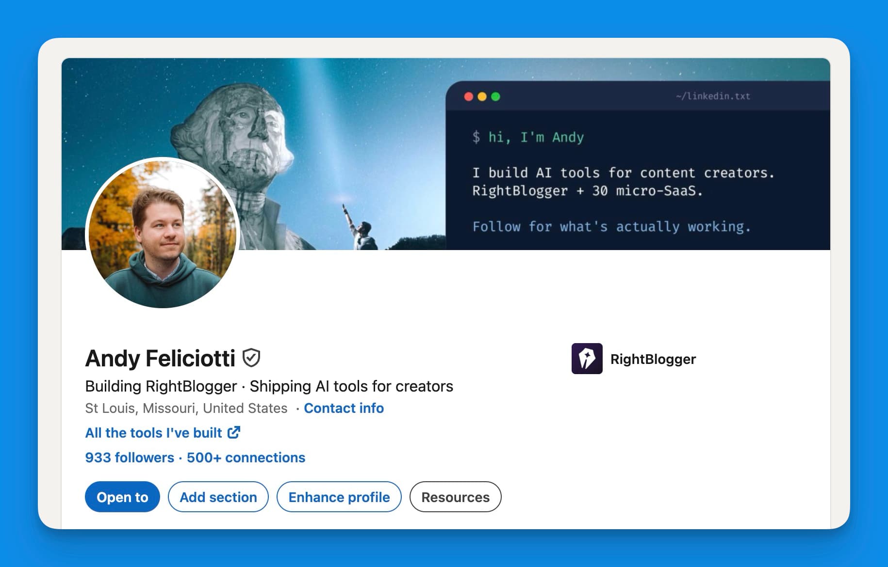
RightBlogger Co-Founder, Andy Feliciotti builds websites and shares photography and travel adventures on YouTube and his travel blog.


Automated SEO Blog Posts That Work
Try RightBlogger for free, we know you'll love it.




Leave a comment
You must be logged in to comment.
Loading comments...